When choosing a countertop water dispenser, it is easy to assume that more buttons mean more functions—and more functions mean a better product.
But does that always make sense?
Think about how you actually use a water dispenser. You fill the tank, get filtered water, choose what you need, and drink. Most of the time, you are not looking for dozens of settings. You simply want clean, chilled water without having to think too much about the machine.
That raises an interesting question: Does a better water dispenser really need more buttons?
The answer may depend less on how many controls a product has and more on how well those controls fit into everyday life.
More Controls Don't Always Mean a Better Experience
Modern appliances often compete by adding more modes, settings, touch controls, and indicators. On a specification sheet, this can make a product look more advanced. But in daily use, every additional option can also mean another decision for the user.
A countertop cold water dispenser is used repeatedly throughout the day. Its interface should therefore make common actions feel natural rather than turning every glass of water into a small learning process.
Which button should you press? What does each icon mean? Do you need to select a mode first? Is there another setting you need to confirm?
For something as simple as getting drinking water, unnecessary complexity can quickly become a form of friction.
This is where minimalist product design becomes more than an aesthetic choice. Simplicity can be part of functionality.
The goal is not to remove useful features. It is to make the features people actually use easier to access.
What Do You Really Need From a Countertop Water Purifier?
A good countertop water purifier should fit naturally into the routine around it.
For most everyday users, the essential experience is straightforward: get filtered water, enjoy it at a comfortable temperature, and move on with the rest of the day.
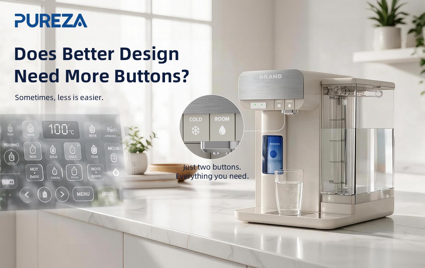
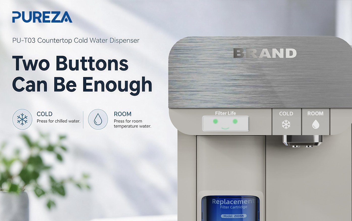
That is one reason the PU-T03 countertop cold water dispenser takes a deliberately simple approach to physical controls. Instead of covering the front panel with multiple buttons, it uses a two-button control design.
Two buttons may sound simple—and that is exactly the point.
The interface is designed around essential daily operation rather than giving users a long list of controls they may rarely touch. Fewer physical buttons also contribute to a cleaner visual appearance, giving the dispenser a more refined and modern feel on a kitchen counter, office desk, or other everyday space.
Minimalism here does not mean “less capable.”
It means less unnecessary interaction.
The PU-T03 still brings together filtered drinking water and chilled-water functionality in a compact countertop format. The difference is that the interaction is designed to stay out of the way.
Simple Operation Should Not Mean Guessing
There is another part of using a water dispenser that is easy to overlook: filter maintenance.
Everyone knows that a water filter eventually needs to be replaced. The harder question is usually when.
If you replace a filter too early, you may not be making full use of its service life. Wait too long, however, and you may forget that the filter needs attention at all.
A calendar reminder can help, but it still requires users to remember when the filter was installed. A numerical indicator can provide more information, but numbers can also require interpretation.
What if the dispenser could simply show you how the filter is doing?
That is the idea behind the PU-T03's emotional filter-life display.
A Filter Indicator You Can Understand at a Glance
Instead of relying only on numbers or technical information, the PU-T03 uses three simple facial expressions to communicate filter status:
Green smiling face: the filter is in good condition.
Yellow neutral face: part of the filter's service life has been used.
Orange crying face: the filter should be replaced.
The concept is intentionally visual.
You do not need to remember a percentage or calculate how much filter life remains. A quick glance gives you a simple indication of the filter's current status.
This is a small design detail, but it reflects a larger idea in modern countertop water purifier design: technology should make everyday tasks easier to understand, not give users more information to process.
A filter status indicator does not need to look complicated to be useful.
Sometimes, a simple expression can communicate what a number cannot communicate as quickly.
Less Interaction, Less Guesswork
The two distinctive design elements of the PU-T03 work together in an interesting way.
The two-button interface reduces unnecessary interaction.
The emotional filter-life display reduces unnecessary guesswork.
One simplifies what you do. The other simplifies what you need to remember.
That combination is especially relevant for a household countertop water dispenser because these products are designed for repeated, everyday use. When something is used several times a day, even small moments of confusion or inconvenience can become noticeable over time.
A well-designed filtered water dispenser should not constantly demand attention. It should provide the information you need, when you need it, and otherwise stay in the background.
This is what thoughtful product design can look like.
Is More Technology Always Better?
Not necessarily.
A better countertop water dispenser does not have to be the one with the most buttons, the most settings, or the most information on its display.
Instead, consider what happens between the moment you want a glass of water and the moment you take the first sip.
· Is the operation easy to understand?
· Can you use the dispenser without repeatedly checking instructions?
· Can you tell when the filter needs attention?
· Does the product look clean and natural in your living space?
These questions shift the definition of “better” from more features to better interaction.
For a countertop water purifier, that distinction matters.
PU-T03: Designed Around Everyday Simplicity
The PU-T03 countertop water dispenser takes a simple idea and applies it to two parts of the user experience.
Its two-button design keeps everyday operation clean and straightforward, while its emotional filter-life display gives users an intuitive way to understand filter status.
Together, these details create an experience built around a simple principle:
Less to operate. Less to remember. Less to figure out.
A countertop cold water dispenser does not need to become the most complicated appliance in the kitchen to provide a thoughtful user experience. Sometimes, better design means knowing which controls to keep—and which ones users never really needed.
Because when it comes to everyday drinking water, the smartest experience may be the one that asks you to think about it the least.